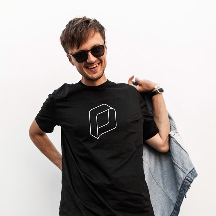
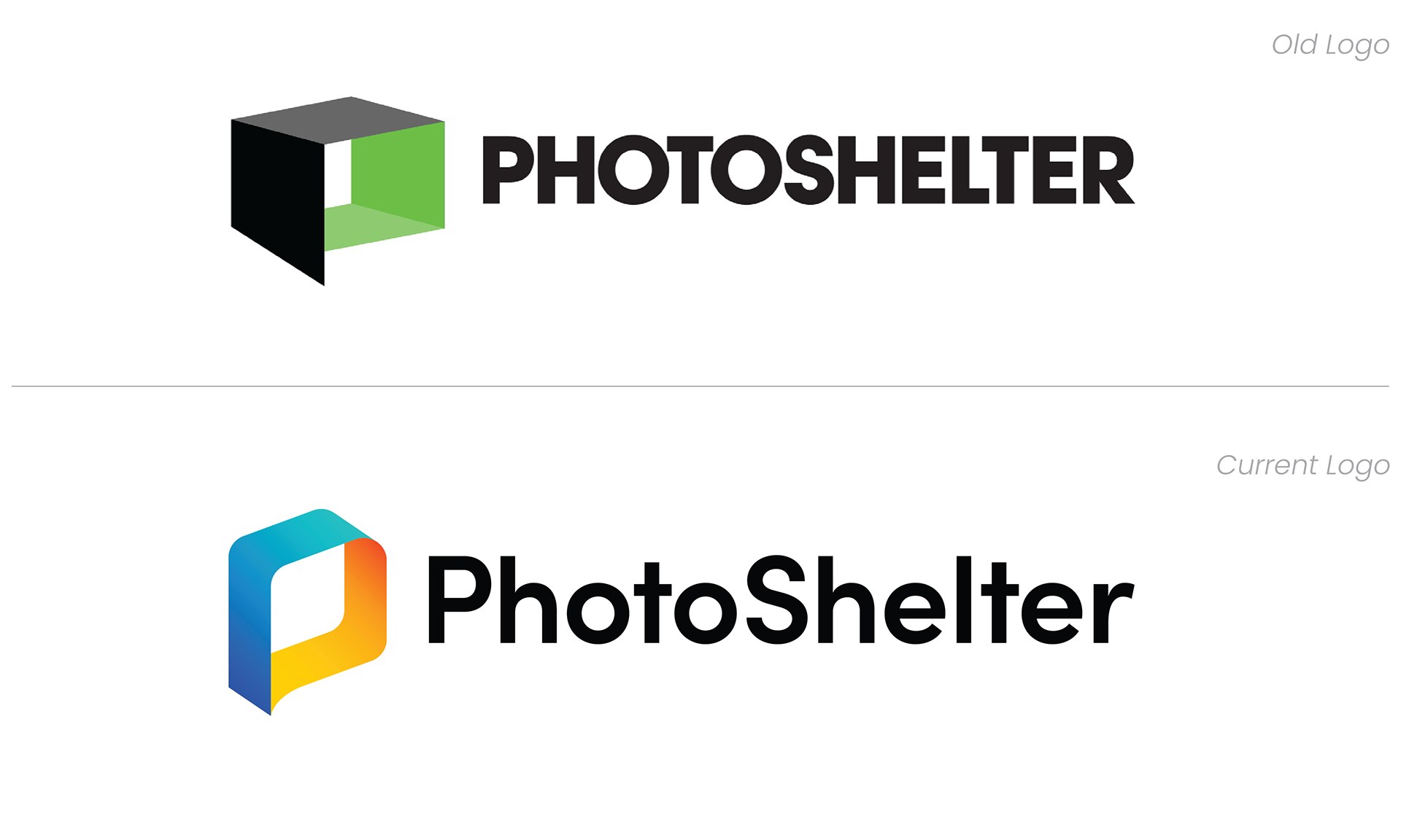
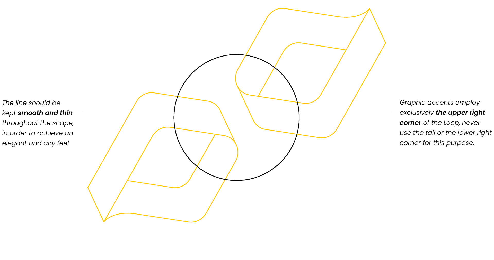
SAY HELLO TO "THE LOOP"
The Loop pays homage to the old logo by adopting its core shape and reimagine it to feel clean, modern and dynamic. The thinner band makes the overall shape lighter, while the rounded corners make it feel friendly and approachable. The Loop's color palette was carefully considered to give an energetic and optimistic feeling, as well as retaining readability over most photography values.
The ribbon-like mark shows two sides of the same figure representing the two sub-brands that live under the umbrella of Photoshelter Inc. Altogether, the Loop embodies the core values of PhotoShelter: all-in, dynamic and heartfelt.
The ribbon-like mark shows two sides of the same figure representing the two sub-brands that live under the umbrella of Photoshelter Inc. Altogether, the Loop embodies the core values of PhotoShelter: all-in, dynamic and heartfelt.

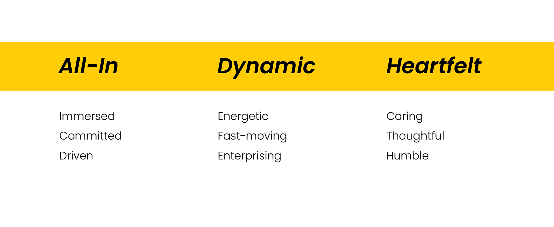
BRAND PERSONALITY
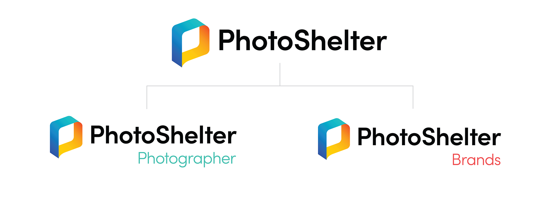
SUB-BRANDING SYSTEM
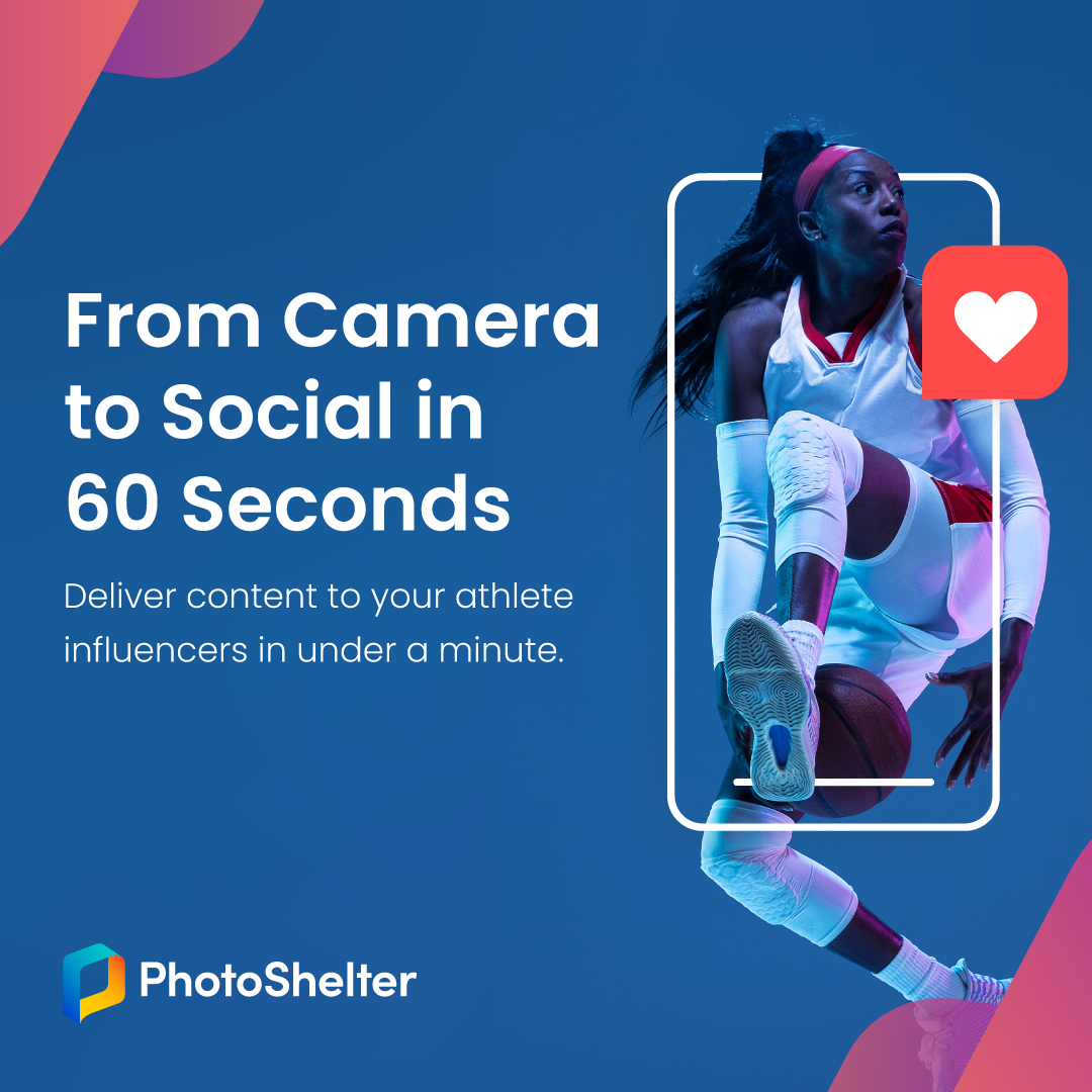
PhotoShelter for Photographers and PhotoShelter for Brands are the two sub-brands that live under the umbrella of Photoshelter Inc. This sub-branding system was designed to be flexible enough to accommodate both existing products as well as any future ones.
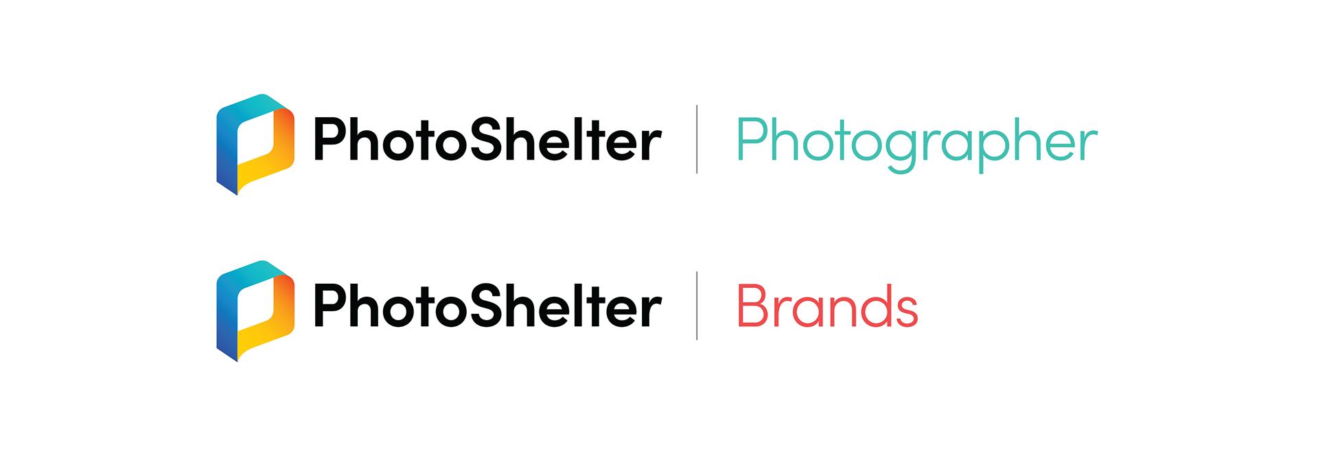
HORIZONTAL FORMAT
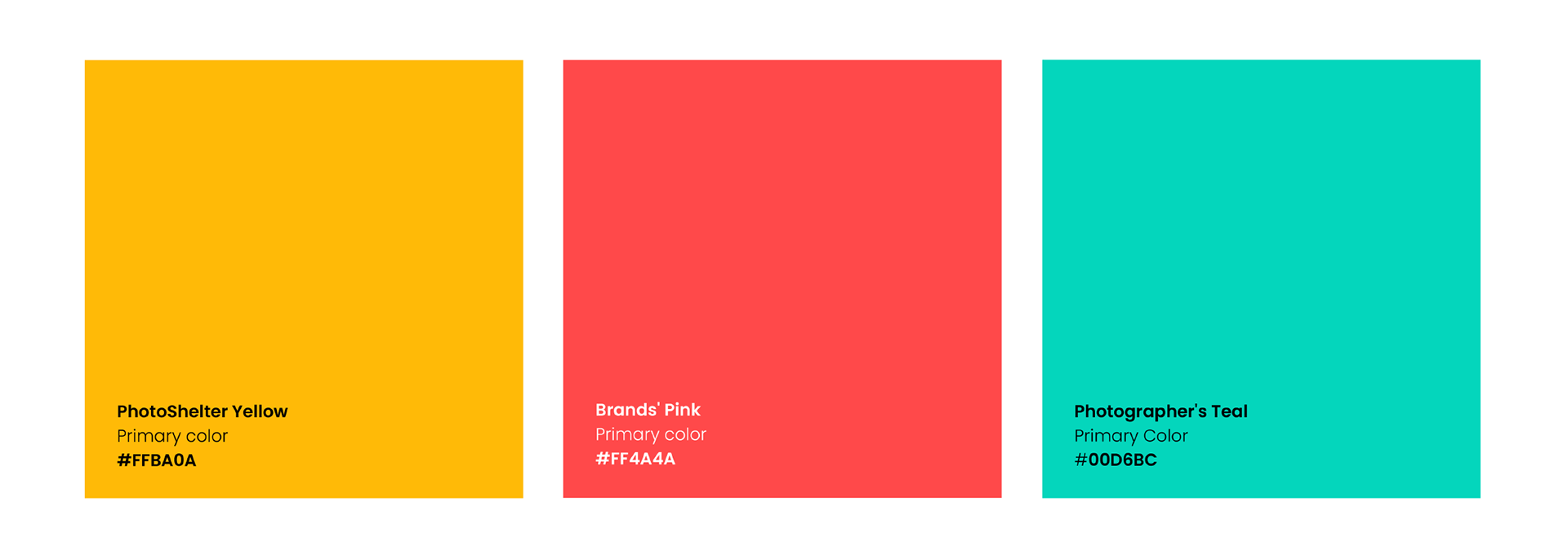
BRAND COLORS
PATTERN

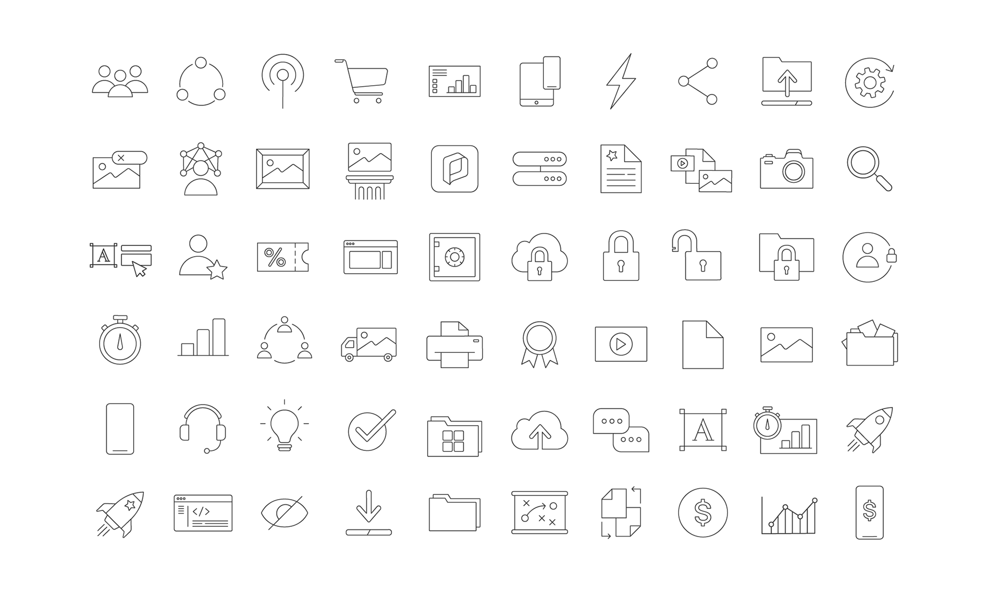
ICONOGRAPHY
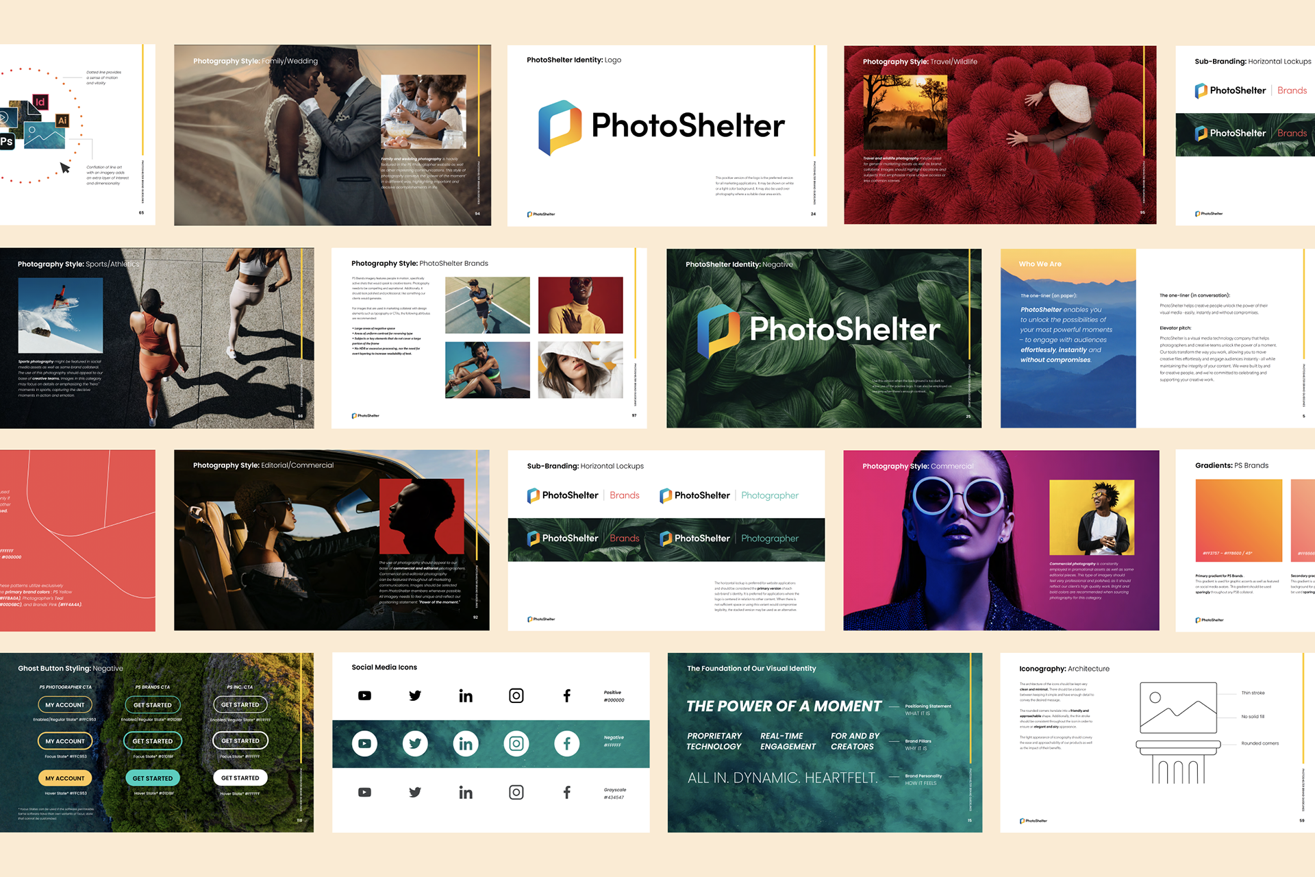
BRAND GUIDELINES
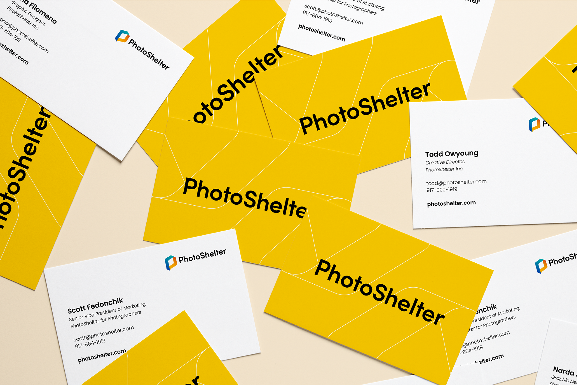
STATIONERY