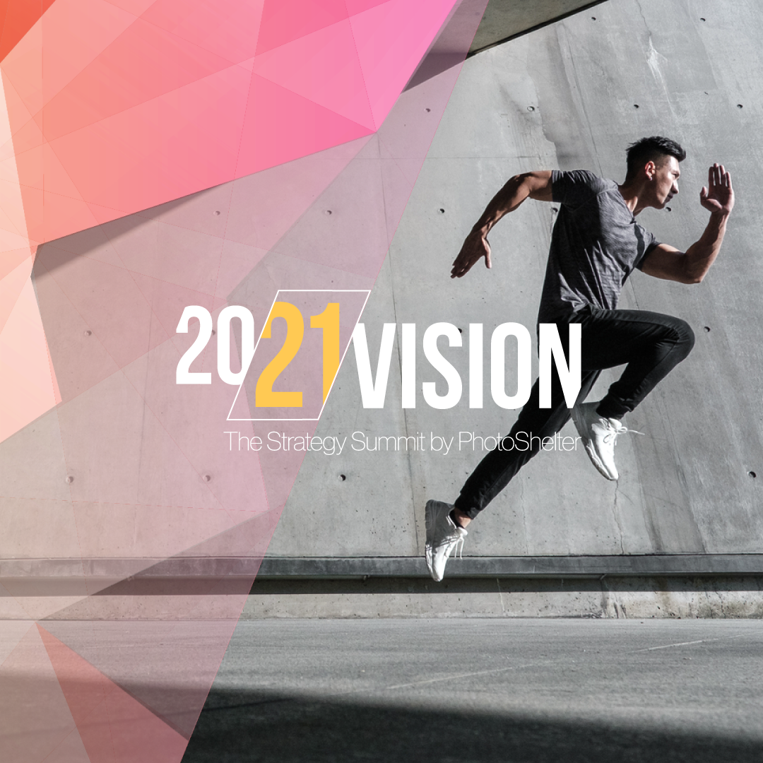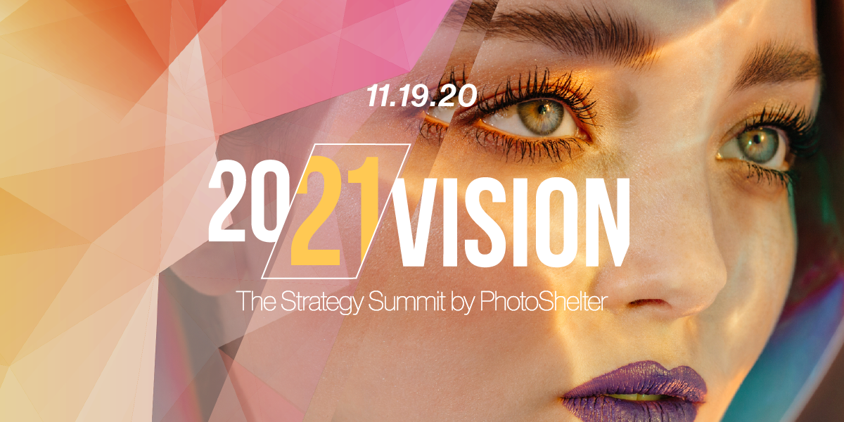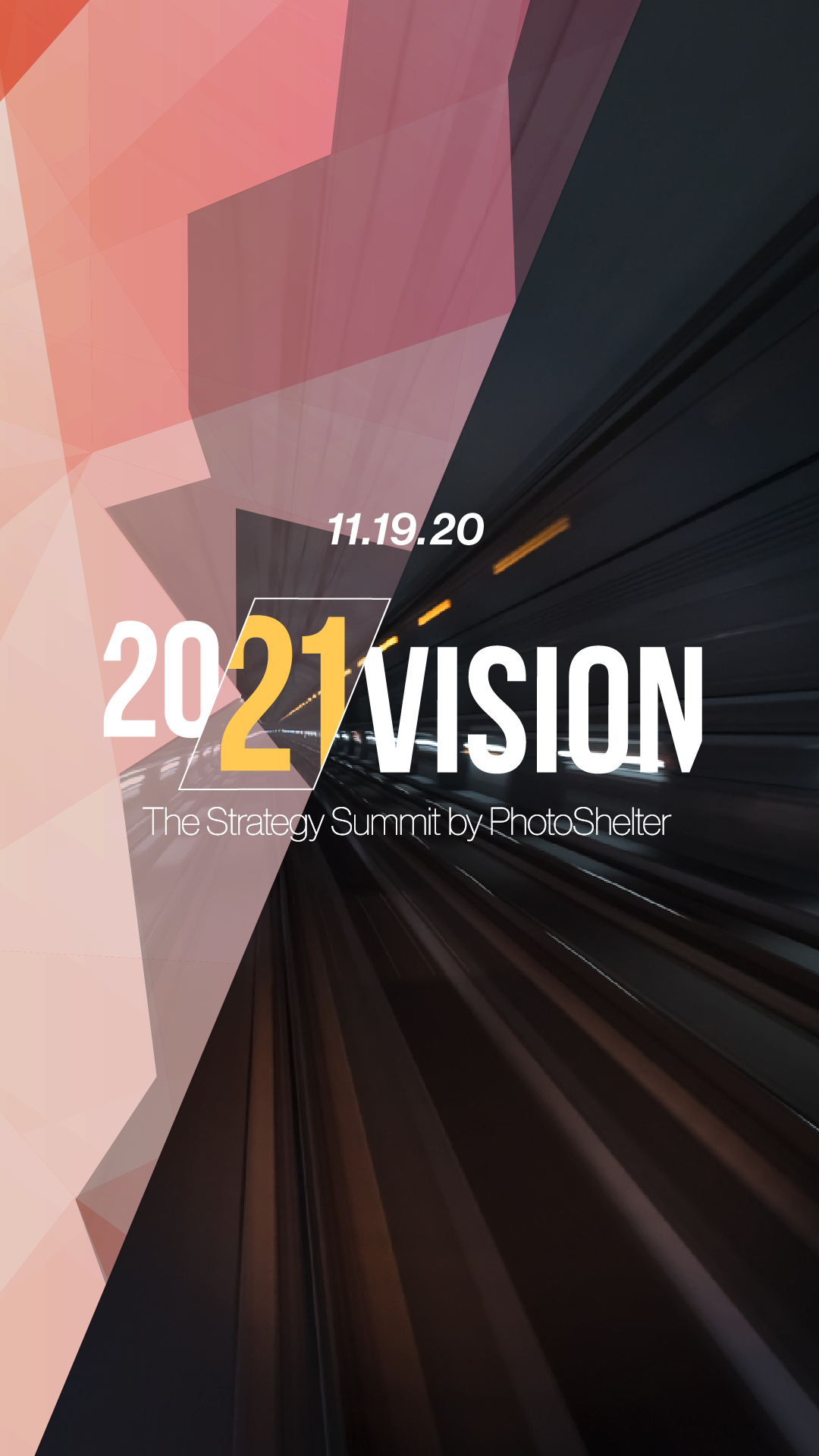

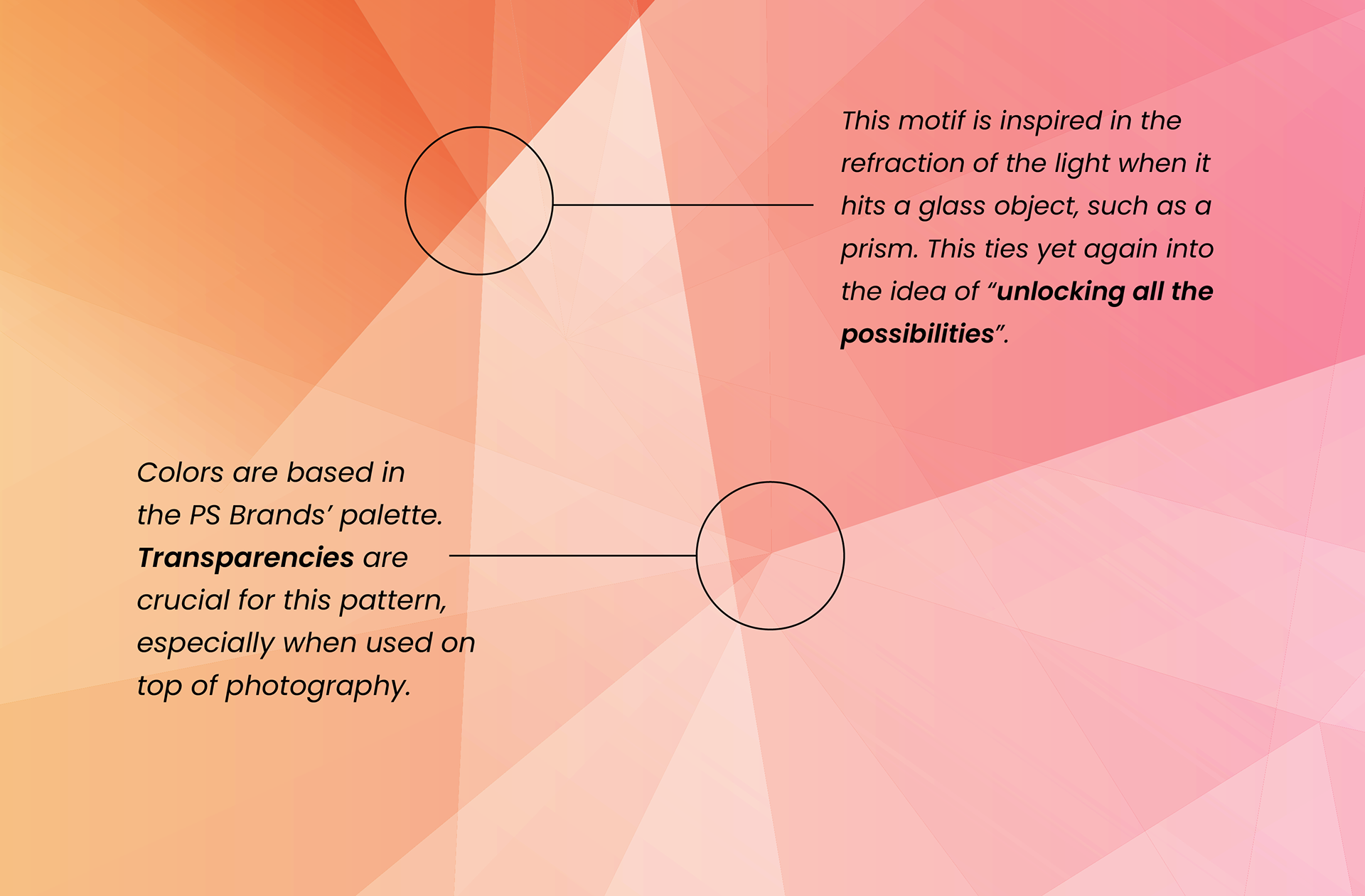
Because this summit was all about looking into the future, the design team decided to work with the concept of prisms and the refraction of light. This idea plays into the name (Vision) and is a great analogy for "unlocking all the possibilities", since white light hits a prism only to be refracted into the colors of the rainbow.
The type lock-up for this project comes across as quite modern and dynamic. It almost feels like the 21 on 20/21 is coming through. Additionally, the pronounced diagonals utilized in the identity contribute to it feeling like it's in constant motion and looking forward.
PATTERN
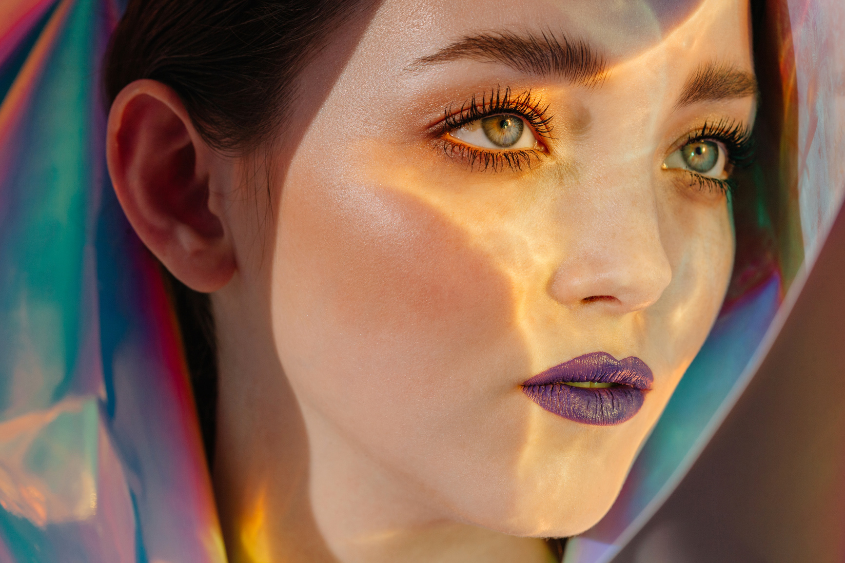
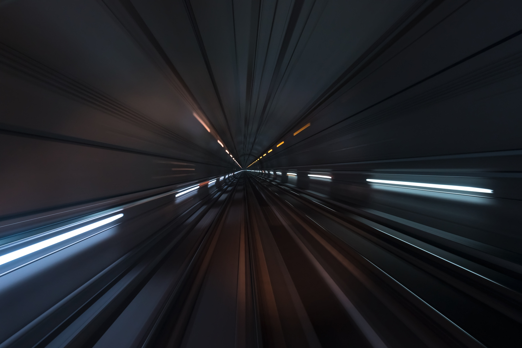
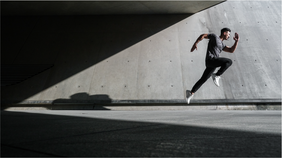
CAMPAIGN IMAGES
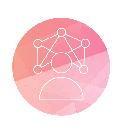
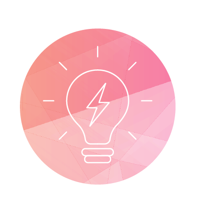
WEBSITE ICONOGRAPHY

SOCIAL MEDIA ASSETS